
 Join The Club


Environment
National Geographic Recognizes Earth’s 5th Ocean
It took over 100 years, but starting now National Geographic will recognize the body of water around Antarctica and below the 60th parallel as the Southern
It took over 100 years, but starting now National Geographic will recognize the body of water around Antarctica and below the 60th parallel as the Southern
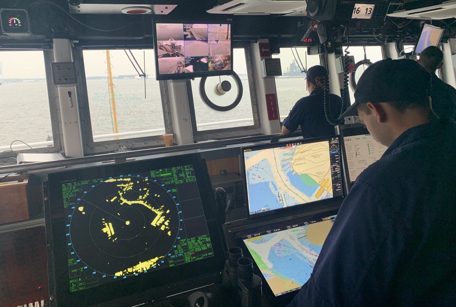
The U.S. National Oceanic and Atmospheric Administration is set to begin implementing its sunset plan for paper nautical charts as it transitions exclusively
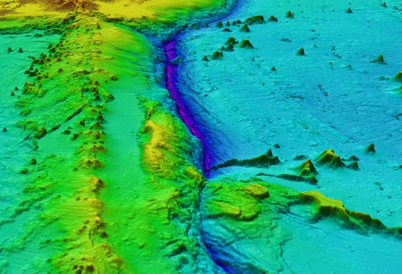
By Jonathan Saul LONDON, June 21 (Reuters) – Plans to map the entire ocean floor by 2030 are going ahead despite the challenges of the coronavirus
By Jonathan Saul LONDON, May 22 (Reuters) – Using data collected from underwater drones, merchant ships, fishing boats and even explorers, a new
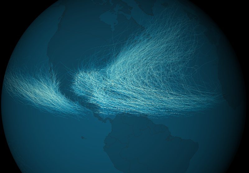
The Environmental Visualization Lab at the National Oceanic and Atmospheric Administration has released images depicting data for a total of 11,967 cyclones
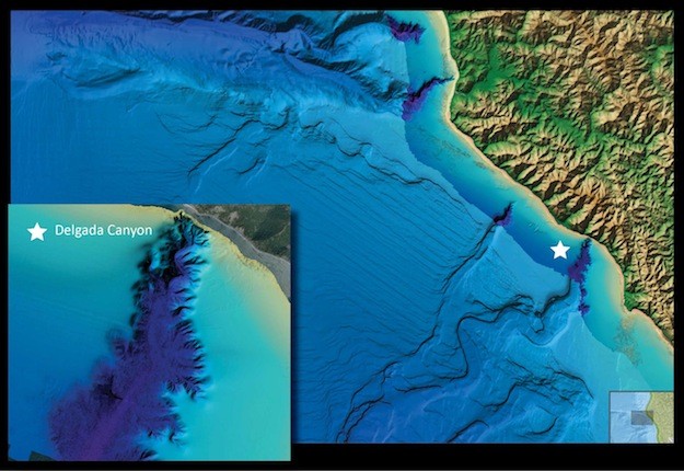
NOAA this week has released a new viewing tool that allows easier access to sea floor maps and other data on the world’s coasts, continental shelves and
The Bureau of Safety and Environmental Enforcement (BSEE) and the National Oceanic and Atmospheric Administration (NOAA) announced today they are partnering to
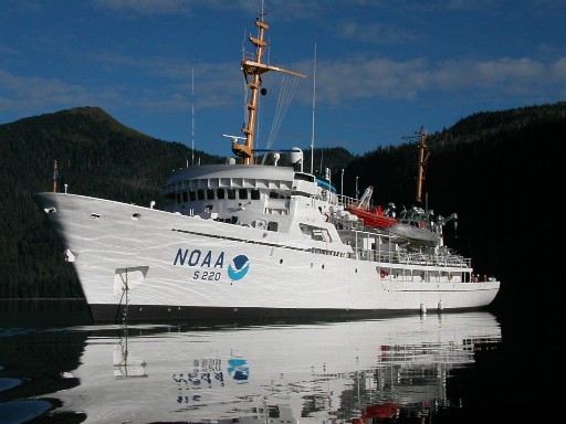
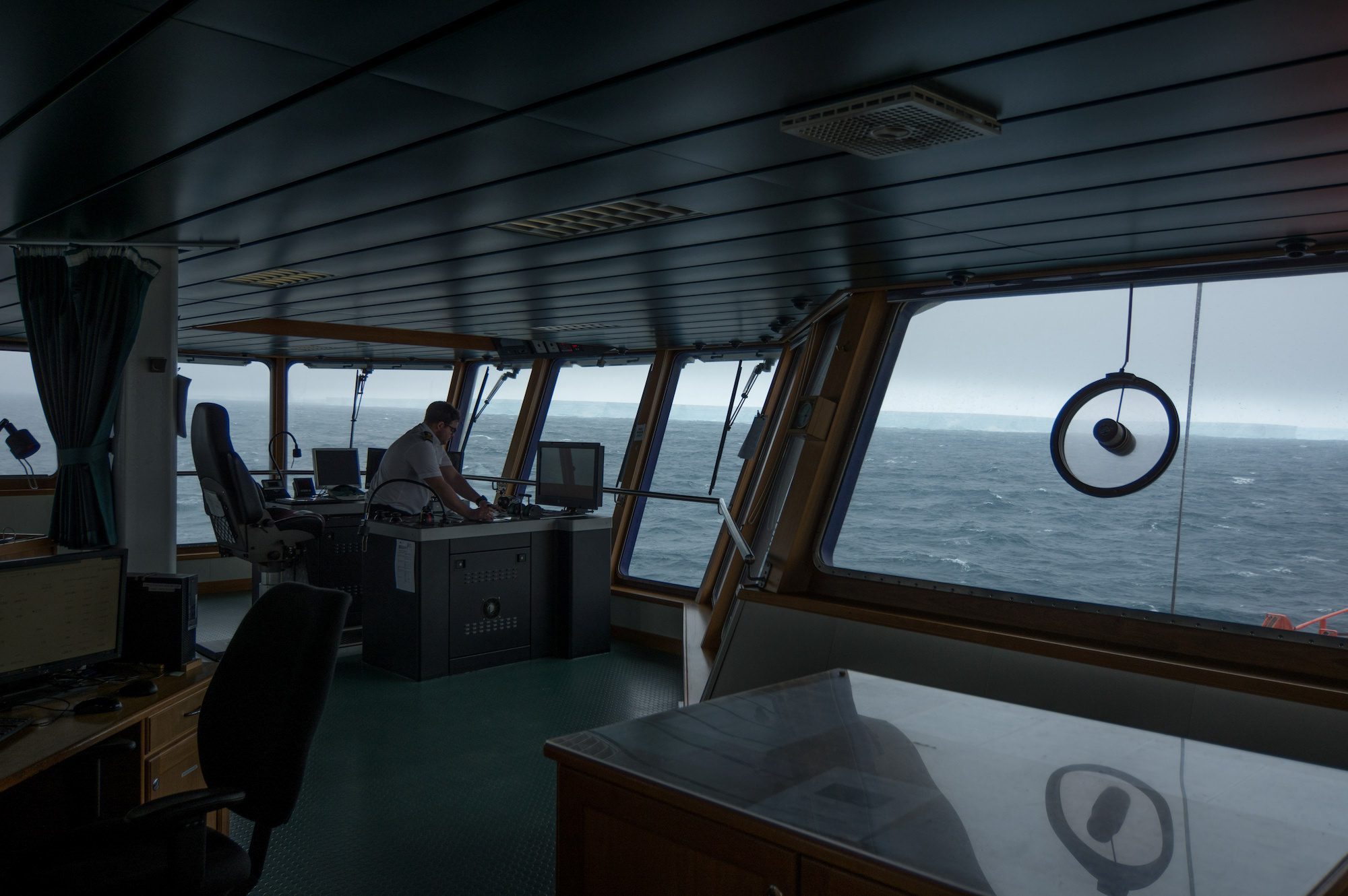
NOAA Ship Fairweather, a 231-foot survey vessel, departed Kodiak, Alaska, today on a mission to conduct hydrographic surveys in remote areas of the Arctic
Today, June 21st, is World Hydrography Day, a day to recognize our ocean surveyors. Check out this video from Mary Glackin, NOAA’s Deputy Under
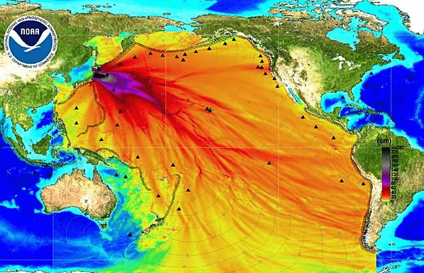
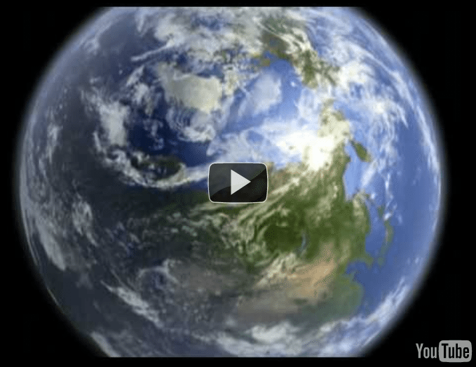
The Above graphic shows the propagation of the recent Tsunami as it moved across the pacific. Click HERE for more tsunami graphics and video from
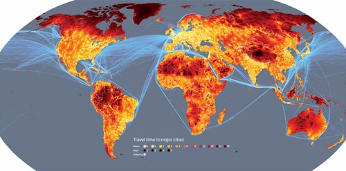
From the gCaptain archives… Here at gCaptain, we are a big fan of maps and when you came across this one, we couldn’t help but to post here on
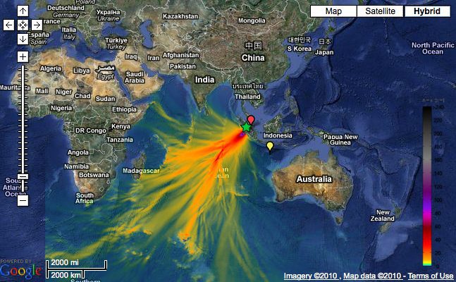
Click image for interactive map Tsunami Event – October 25, 2010 Mentawai, Indonesia The Indonesia tsunami event was generated by a Mw 7.7 earthquake
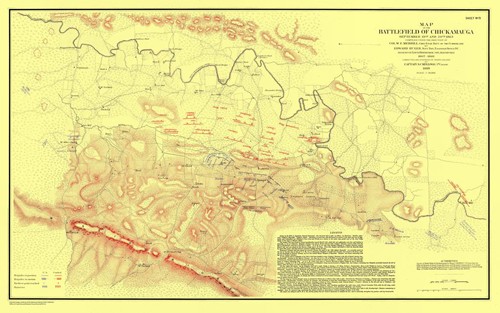
U.S. Coast Survey cartographers traveled with Union forces to produce battlefield maps during the Civil War (Map of the Battlefield of Chickamauga). Credit:

Click on image for enlargement. 2010 Submarine Cable Map TeleGeography’s popular Submarine Cable Map has been fully updated for 2010. The latest edition
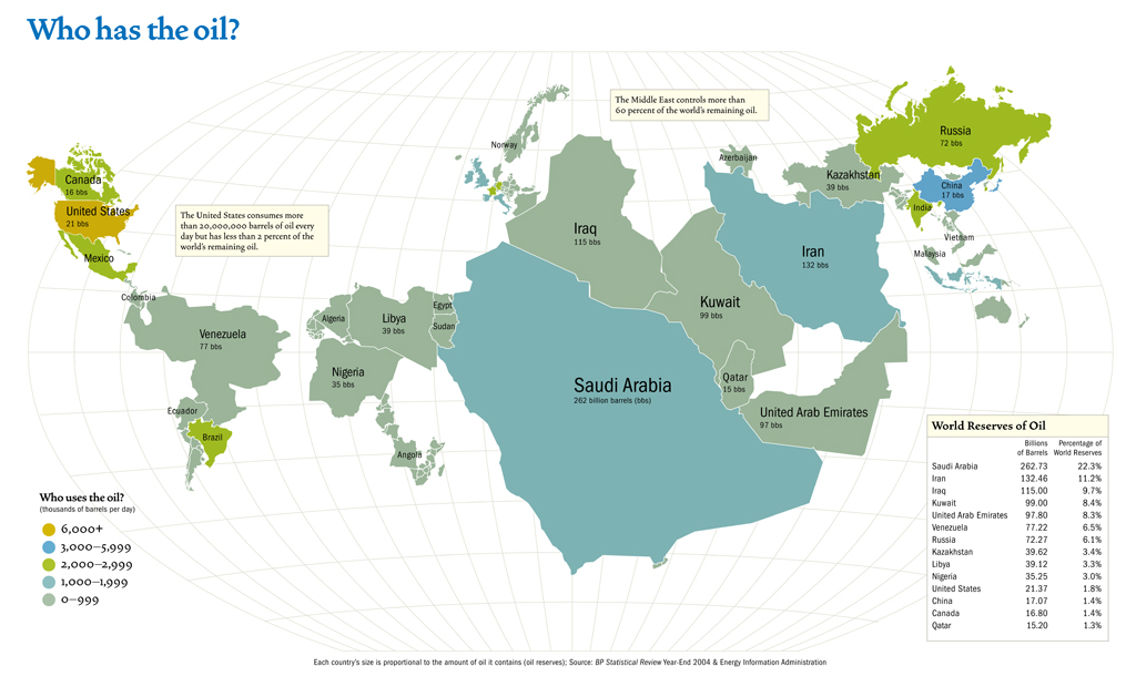
“The United States consumes more than 20,000,000 barrels of oil per day but has less than 2 percent of the world’s remaining oil” This map,
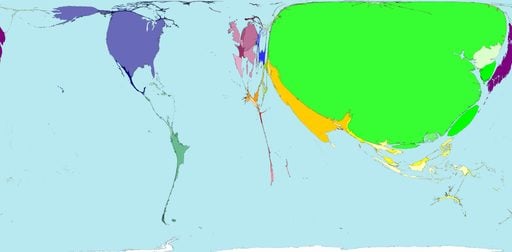
This map from worldmapper.org uses relative size to show proportion of all shipping containers being loaded and unloaded in each country. There are more
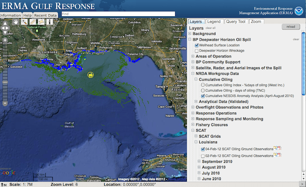
The dynamic nature of the BP oil spill has been a challenge for a range of communities – from hotel operators to fishermen to local community leaders. We

This post is brought to us by Peter Mello of Sea-fever.org (via NOAA), in two seperate installments. The first post a map of Ocean Energy Distribution Map
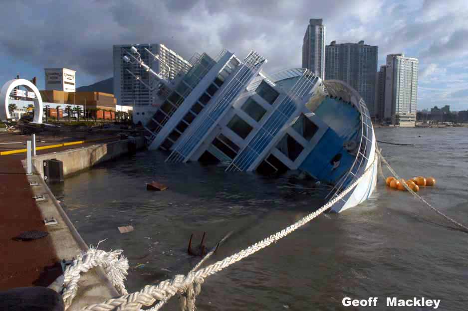
Original Photo Found HERE. While this is a rather old story, it just came to our attention through one of our many vast searches on the internet. This photo

This was brought to our attention by digg.com, the social networking site that allows its users to submit links and news stories and then list the stories by
Essential maritime and offshore news, insights, and updates delivered daily straight to your inbox


Essential news coupled with the finest maritime content sourced from across the globe.
Sign Up