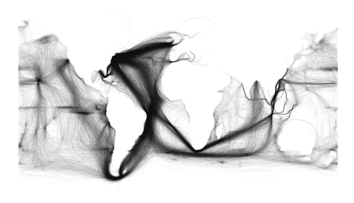
Ben Schmidt’s world chart created with a blank screen and thousands of data points from old ship logbooks.
Related Book: Hell Around The Horn by Rick Spillman
Scan a large collection of 18th- and 19th-century ships’ logs (1), plot them on a blank digital canvas canvas, and you get this extraordinary world map. This map was featureless to begin with, yet we can clearly discern the contours and shapes of the continents. That is the cumulative effect of significant numbers of coast-hugging vessels, generating enough data points to show the length and breadth of the land.
“A map I put up a year and a half ago went viral this winter” says map creator Ben Schmidt . “The motivation for the series is that a medium-sized data set like Maury’s 19th century logs (with ‘merely’ millions of points) lets us think through in microcosm the general problems of reading historical data. It shows the paths taken by ships in the US Maury collection of NOAA’s ICOADS database.”
Big Think blogger Frank Jacobs [2] points out that some contours are notably absent: the Red Sea, the Persian Gulf, the eastern half of the Mediterranean, the Black Sea, the northern shores of Siberia, Canada and Australia. Too few ships (or at least too few ships with log books) plied those waters before the construction of canals and steel ships.
The most striking feature of the map, however, are the broad bands of traffic moving across the high seas. Their sheer volume reflects the economic importance of each transoceanic flow with the centre of gravity for global maritime commerce is the east coast of North America. Three thick bundles of traffic, each composed of countless individual ocean crossings, converge on the continent’s eastern seaboard.
At first glance, we see how commerce binds the world together – and which parts of the world more closely than others. Even more interesting when you compare Schmidt’s map with modern ship data like the following video compiled with the help of millions of satellite AIS plots.
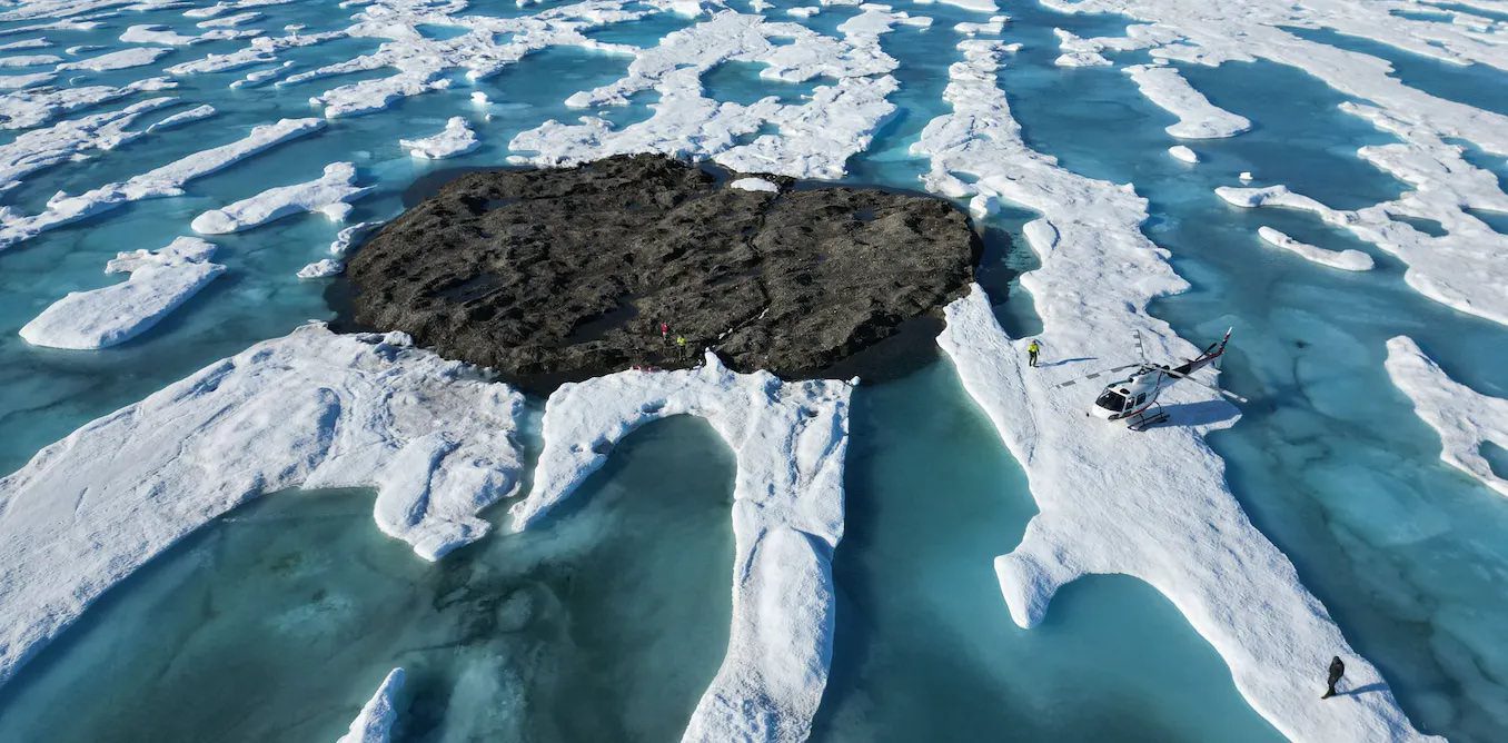
by Kevin Hamilton (University of Hawaii) In 2021, an expedition off the icy northern Greenland coast spotted what appeared to be a previously uncharted island. It was small and gravelly,...
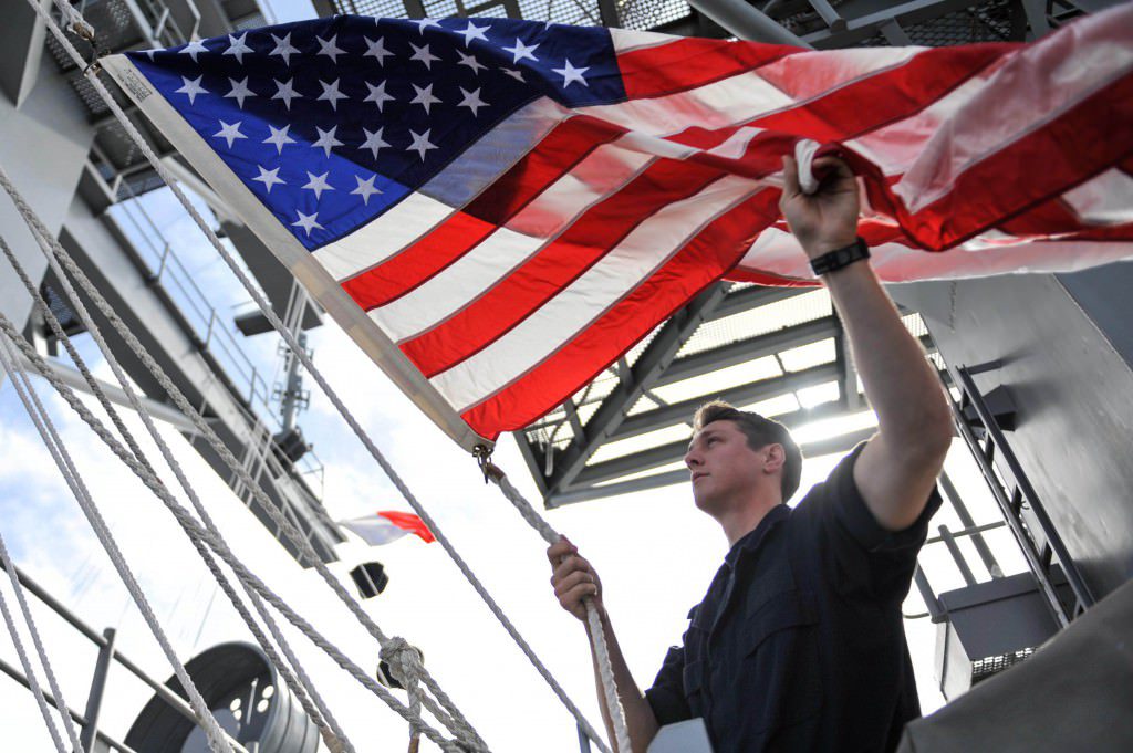
by Salvatore R. Mercogliano, Ph.D. (gCaptain) This Veteran’s Day we remember the thousands of Soldiers, Sailors, Marines, Airmen, and Coast Guardsmen who gave their lives in defense of the United States...
by Sébastien Pelletier, Université Laval (The Conversation) Of all the rivers in the world, the St. Lawrence River is undeniably one of the most challenging for mariners. This water highway...
October 9, 2022
Total Views: 15607
Get The Industry’s Go-To News
Subscribe to gCaptain Daily and stay informed with the latest global maritime and offshore news
— just like 104,729 professionals
Secure Your Spot
on the gCaptain Crew
Stay informed with the latest maritime and offshore news, delivered daily straight to your inbox
— trusted by our 104,729 members
Your Gateway to the Maritime World!
Essential news coupled with the finest maritime content sourced from across the globe.

 Join The Club