Photo by mchaconcr
Is the tsunami a maritime news story? Should gCaptain be providing coverage and at what level? These are some of the questions gCaptain editors have been facing since our founder’s town, Morro Bay California, was partially evacuated last night.
Our decision was to give the matter some time and solicit an article about the effects of tsunami’s on ships, possible including a sea story or two. Until that happens, however, we wanted to share one of our favorite aspects of environmental disaster… infographics.
Wikipedia tells us that “Information graphics or infographics are visual representations of information, data or knowledge. These graphics are used where complex information needs to be explained quickly and clearly[1], such as in signs, maps, journalism, technical writing, and education. They are also used extensively as tools by computer scientists, mathematicians, and statisticians to ease the process of developing and communicating conceptual information.” But more clearly they can be described as the amazing drawings newspapers and magazines use to lure in readers.
So here are the best examples of infographics to help you learn more about tsunami’s and Tidal Waves. Click on the images for the full sized versions. Enjoy!
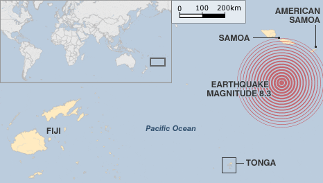
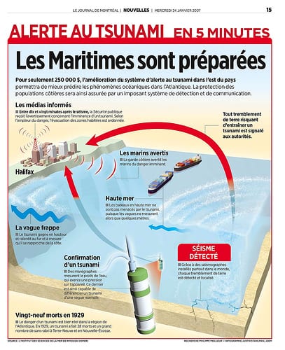
Yesterday’s Tsunami – Samoa

The Threat Of Tsunami Waves To San Francisco, California

The Asian Tsunami Explained – NYTimes

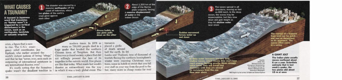
What Causes A Tsunami
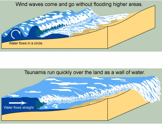
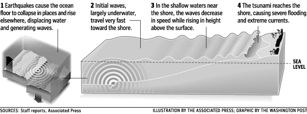
How A Tsunami Wave Forms
How High Is A Tsunami Wave?

USAToday’s Natural Disaster Map

International Tsunami Graphics
NOAA’s DART Tsunami Warning Buoy System

*Ugly But Effective Infographics
Indonesia’s Tsunami Warning System

Towering Tidal Waves

*Infographic Tsunami Videos
Tsunami Infographic – The Movie
[vimeo]http://www.vimeo.com/741583[/vimeo]
Related Tsunami Links:
Updated: February 5, 2026 (Originally published September 30, 2009)
Editorial Standards · Corrections · About gCaptain

 Join The Club


